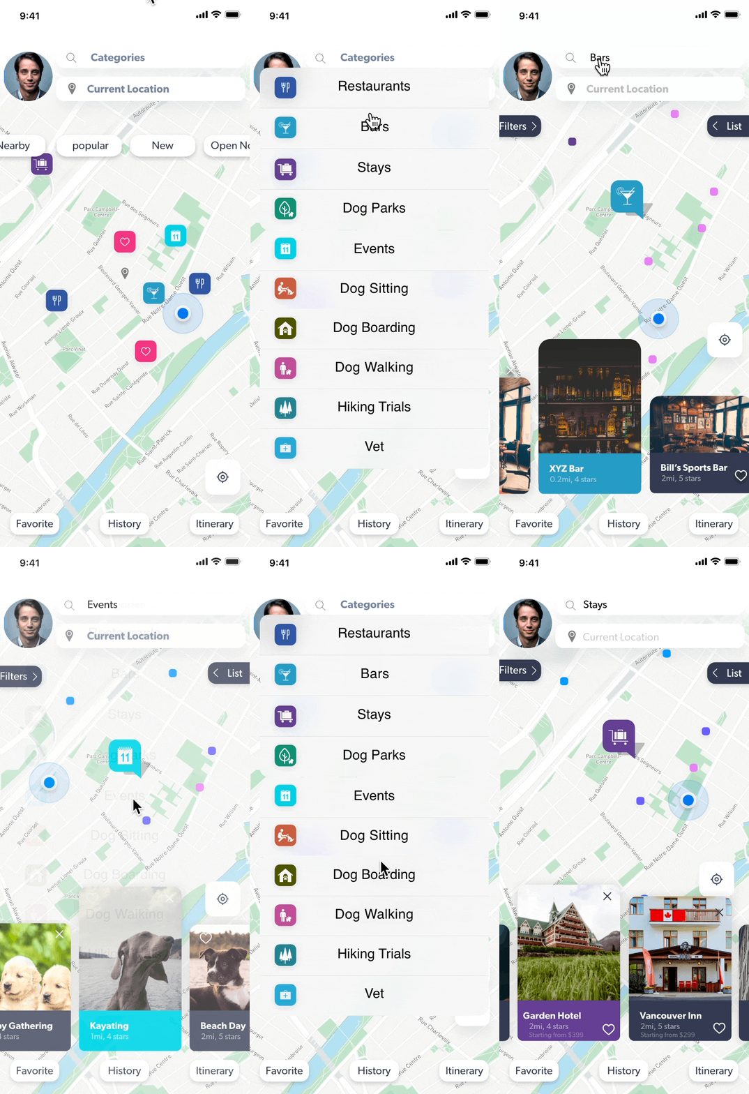
BringFido is an existing app that I redesigned. This app is to assist dog owners to better locate dog-friendly events and businesses.


1. UI visual design is confusing and complicated.
2. More functions needed to elevate user experiences.
3. There are unnecessary steps, creating more complicated task flows.
1. Revise home page, icons, logo and visual hierarchy.
2. Add distance estimates and create in app page links rather than sending users away from the app.
3. Prioritize contents, eliminate unnecessary informations and refine categories.
Should mainly focuses on presenting essential functions including categories, mapping, filtering and ways to access user to meet their goals.


The original app tend to lead users to other platforms. It's best to keep users on the app by providing comprehensive functions through out the steps.


The shorter the task flow the better the experience. This elevates user experiences.


I talked to over 20+ dog owners for their insights.
I conducted over 200+ survey feedbacks by visiting local dog parks for owners opinions.
From feedbacks and interviews, people expressed that they would prefer more clear instructions and directions and less steps when using the app.
I used A/B testings and user testings to get feedbacks to further improve the user experences.
After conducting multiple user testings and revisions I completed my app redesign.
I went to the dog parks again to ask dog owners to test out my revisions. They were generally very happy with the functions, clarities and simple steps. Out of 76 people, 59 find it better than the original app and 17 find it indifferent.